
In 1860 George Eliot wrote “You can’t judge a book by its cover” in her book The Mill on the Floss. (And yes, George Eliot was the pen name of Miss Mary Ann Evans.)
But in the publishing world, people do judge books by their cover. In fact, book covers are one of the most important factors in book sales — especially for unknown authors.
On my path to publishing, I enrolled in several book design webinars, and here’s what I learned:
Non-fiction and fiction book covers have much different rules for design. For instance, in non-fiction books it’s all about the typeface and the colors. Images are not a primary focus.
Fiction book covers, however, are driven by images. For example, mysteries and detective novels often feature cover designs that are bold, with vector or silhouette images in red and black. Romance novels usually have a beautiful woman and/or a hunky (bare-chested?) man on the cover. Western fiction often includes a horse and a cabin along with images of the characters.
Next, what typeface should the title use? Script? Serif? Sans serif? I learned that serifed fonts were preferred, but loopy, script fonts were a common selection for romance novels like mine.
Finally, the color palette. A majority of historical fiction readers are women, so choose colors that will appeal to them: soft pastels, bright pinks, etc.
The webinars all suggested researching other books in my particular genre, and using that as a guide for cover design. In essence: design a book cover that looks like every other book in that category.
But that advice goes against my years of experience in marketing and advertising. I counseled clients to “break through the clutter” (and there’s a lot of that everywhere) with design that is memorable — design that stands apart and builds a brand. My advice was to “not look like every other widget” in the industry. And that was my advice to myself — create a book cover that didn’t copy other books, but still told the story and set the scene for Proving Her Claim.
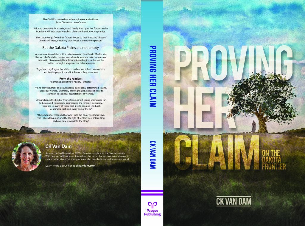
For that task, I asked the most talented designer I know to create a book cover for me: Doug Moss. Doug is an excellent designer and illustrator, but it’s his watercolor paintings that speak to me. So I asked for a watercolor painting on the book cover. In my research, I didn’t see a lot of imagery using watercolor paintings, and that also confirmed my design direction.
I tried to be a good client: I provided guidance and ideas. I encouraged exploration. I gave prompt input when a design was presented. Together, we collaborated on a book cover design that utilizes a watercolor painting with a small illustration of my heroine, Anna Olson, by a large cottonwood tree. The title font is bold but integrated into the design, something I didn’t see in other historical fiction book covers.
It’s magical. Thank you, Doug.